About Monkey 2 › Forums › Monkey 2 Projects › New gui -test view
This topic contains 16 replies, has 3 voices, and was last updated by  AdamStrange
 2 years, 7 months ago.
-
AuthorPosts
-
September 3, 2016 at 11:57 am #3634
After some arguing with Mojox, I decided to make my own gui.
Here is the code:
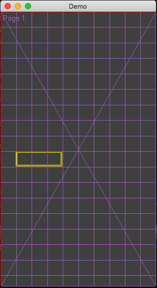
Monkey123456789101112131415161718Method New()Super.New( "Demo", 840, 480, WindowFlags.Resizable )local Page := New UXPageView( "Page 1" )Page.SetGridX( 10 )Page.ShowGrid = TruePage.PageColor = Color.DarkGreyLocal button1 := New UXControl()button1.SetGridLayout( 1, 9, 3, 1 ) 'x, y, w, hbutton1.Border = 2button1.ShowGrid = TruePage.AddControl( button1 )ContentView = PageEnd methodAs you can see it is page based.
You add controls to pages. It’s not that far removed from Mojox in some respects.
The page has been set a grid with an X of 10. This means the grid will always have 10 cells across and as many cells using the width down.
next up is a control starting at cell 1,9 with a width of 3 cells and a height of 1 cell. It’s got a uniform 2 pixel border
Here is the result. Nothing fancy and only showing the grid and controls placement. There are no actual ‘controls’ as I am dealing with the layout system first.
I have also written the layout engine to support pixel layouts and floating layouts where you tell the control where to go and it decided the rest. I’ve also written a vertical and horizontal splitter control so you can resize layouts
Attachments:
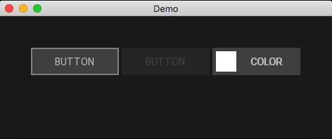
September 4, 2016 at 10:05 am #3641using the same grid (now hidden) I’ve created the first base control:
– base button. This has no drawing routines, but has all the basics for any derived button, keyboard and mouse controls, etc
From this I have made two more buttons:
button which is just the standard button and colorbutton which is a … color button
The base control and page view knows about focussed controls. I am using an outline to show the focussed control (the left one). You use tab to go to the next control and shift+tab to go back
pressing return will activate the “clicked()” property like you would if you had clicked the mouse
Shown are three buttons. The left has the focus, the middle is not enabled (greyed out) and the right is a color button.
Resizing the window sizes all the buttons and contents as you would expect
Attachments:
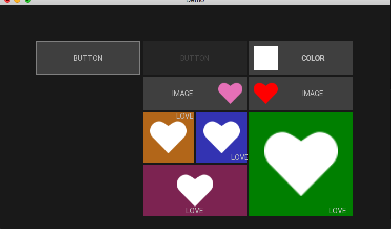
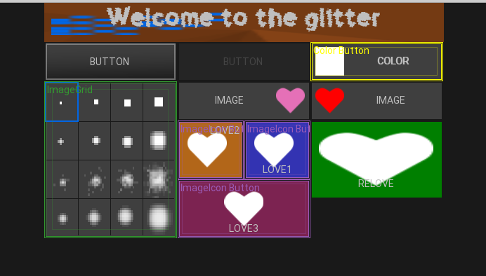
September 4, 2016 at 11:58 am #3644and a more colourful example with new image buttons
There is only one image used – it can have a color so you can color images, align them as well as text
Attachments:
September 5, 2016 at 1:28 am #3654Very clean looking
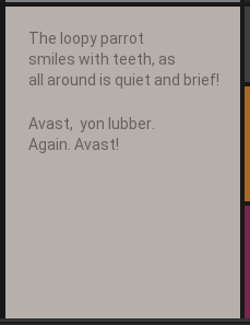
September 5, 2016 at 5:55 am #3658Here’s a couple of shots of the new text control. you feed it a single string with (/n) for line breaks and it will flow the text. currently only left aligned, but I’ve got to start somewhere

The two show the text flowing with different sized controls:
September 5, 2016 at 6:04 am #3661Here’s the same but showing all the controls and the grid at the same time
The grid is locked to the width of the app.
grids can totally fit the page size (resizing with the window)
or be locked to the width of height where the grid will always remain square.
Attachments:
September 6, 2016 at 10:20 am #3699Yep the GUI gets the name of Oberon. It was called NogoX, then UberX and finally Oberon.
Added an inset value. So in a lot of respects there is common ground between Mojox and Oberon.
So for any control you have a size which the layout engine decides. There can be drawing onto this.
The there is a pixel border (currently uniform) Which gives you the controls drawing area
The inset is a uniform value from the drawing area inside the control. Text and other items such as images align to this.
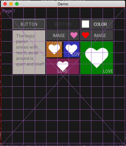
lots added: images, fonts. fg and background colors, new grid control (tab and arrow aware)
Here’s a “really horrible” look at the new stuff:
Some of the controls are shown in design mode – the control type, outline borders, border and feint inset. If you look at the color button on the right. you can see how the color snaps to the inset. The Text is properly aligned within the free space
The grid control shows an image grid, where you feed it a bitmap with the images in a strip and it is treated as buttons.
The first button has an image and color as the face. in this case it is a faded gradient.
Lastly the label on the top have two images both a background one (set to dark orange) and a foreground one (set to blue). You can also see that there is an inset which is making the blue image float on top of the orange image.
You can also see a custom font being used here.
Next up is the faders
Attachments:
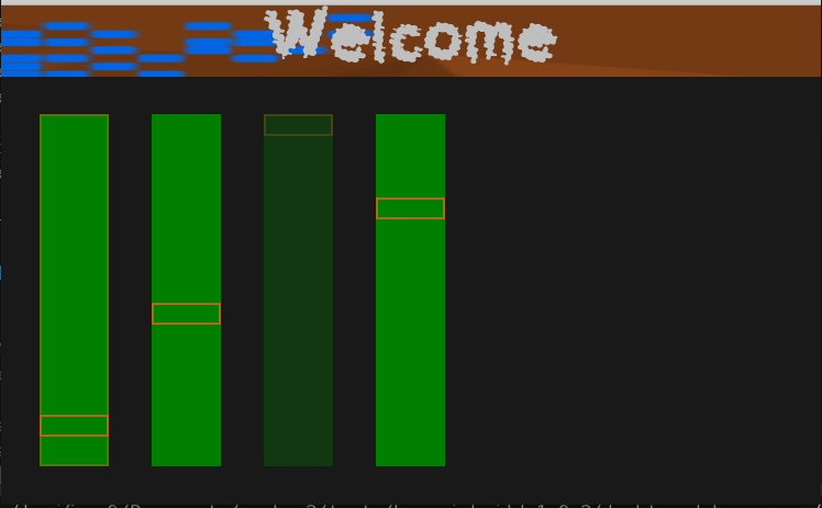
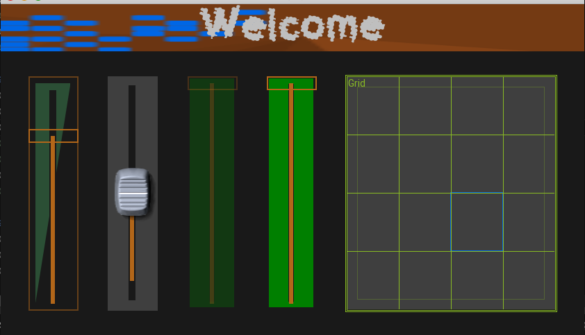
September 6, 2016 at 1:55 pm #3702after clearing the page and putting four vertical faders (one not enabled) here is the result
Tab aware but not keyboard aware yet. fully mouse aware with wheel support all functioning
Starting to show much promise
Attachments:
September 7, 2016 at 7:38 am #3730September 7, 2016 at 2:33 pm #3747I think i’ll be quiet for a bit as I am looking at the actual designer. So you should be able to grab drop controls and then get the produced code
September 8, 2016 at 2:29 am #3753Nice work, Adam
 September 8, 2016 at 4:47 am #3755
thanks. I really wanted to use mojox, but just couldn’t get it’s layout engine to operate correctly
September 8, 2016 at 6:40 am #3756mmm, that was not quite so difficult after all.
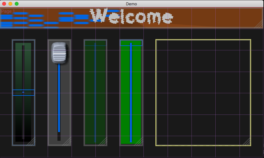
the first image is the new designer view. where each control has a thick border and a size indicator in the bottom right corner. The logical thing here would be a list so you can select each control from it and also quickly see the controls – some might not be visible in the view!
As you move in the view the control below the mouse is highlighted
if you press the mouse in the bottom right, the control highlight turn blue and ‘resize’ appears – basically prompting you. You can then resize the control to any size from 1 grid upwards.
Similarly if you press the mouse when over a control and not sizing the word “move” appears, allowing you to drag/move the control to any new grid position
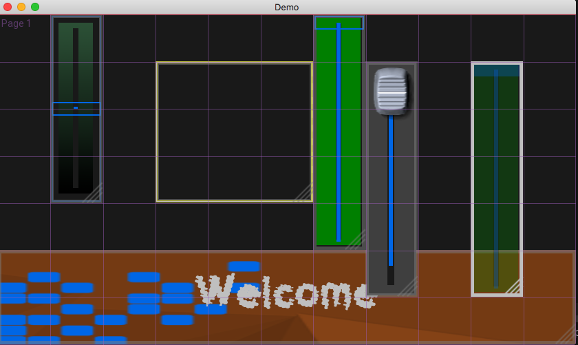
The second image shows the result of doing this a few times.
Note. that controls can be above other controls. so you could use image panes as backgrounds, etc allowing for complex looking resizable designs.
There is also something interesting going on with the first pic. The controls are not at int grid positions!.
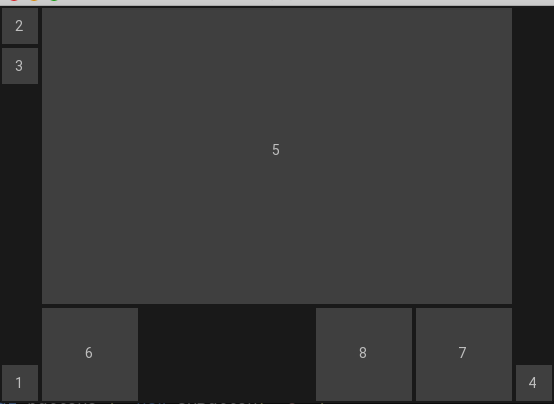
September 8, 2016 at 7:56 am #3760September 8, 2016 at 11:12 am #3765ok. now for some pixel accurate layouts. These have prefixed sizes, but will logical flow correctly
First look at the pic. It shows 8 controls (the grey blocks). Each block is numbered in the order it was added to the page
The order is important as it controls how the free space is allocated. In essence, add your fixed controls first followed by your floating ones.
In this demo there are tow fixed areas of 40 pixels on the left and right
The left has three buttons – two at the top and one at the bottom, the right has one at the bottom.
The rest of the space is filled with a top filled control and then one control filled to the left, and two filled to the right.
Have a look at the pic and reread this again.
OK. Here is the code itself:
Monkey123456789101112131415161718192021222324252627282930313233343536373839404142434445464748495051525354Method New()Super.New( "Demo", 840, 480, WindowFlags.Resizable )Page = New UXPageView( "Page 1" )' Page.SetGridX( 11 )' Page.SetGrid( 11, 7 )' Page.ShowGrid = TruePage.PageColor = Color.PicoBlack' Page.Designer = truelocal button1 := New UXButton( "1" )button1.SetPixelLayout( "leftbottom", 40, 40 )local button2 := New UXButton( "2" )button2.SetPixelLayout( "leftdown", 40, 40 )local button3 := New UXButton( "3" )button3.SetPixelLayout( "leftdown", 40, 40 )local button4 := New UXButton( "4" )button4.SetPixelLayout( "rightbottom", 40, 40 )local button5 := New UXButton( "5" )button5.SetPixelLayout( "topfill", 300 )local button6 := New UXButton( "6" )button6.SetPixelLayout( "leftfill", 100 )local button7 := New UXButton( "7" )button7.SetPixelLayout( "rightfill", 100 )local button8 := New UXButton( "8" )button8.SetPixelLayout( "rightfill", 100 )' button1.ShowGrid = TruePage.AddControl( button1 )Page.AddControl( button2 )Page.AddControl( button3 )Page.AddControl( button4 )Page.AddControl( button5 )Page.AddControl( button6 )Page.AddControl( button7 )Page.AddControl( button8 )'this needs to point to an active control to be used' Page.Focus = slider1ContentView = PageEnd methodWhich is very simple to understand and need no further lambdas or container panels to correctly resize things
Attachments:
-
AuthorPosts
You must be logged in to reply to this topic.