About Monkey 2 › Forums › General Programming Discussion › Powered by Monkey 2 logo.
Tagged: Logo Retro Oh Fucking Yes
This topic contains 53 replies, has 19 voices, and was last updated by ![]() Richard Betson
Richard Betson 8 months, 1 week ago.
-
AuthorPosts
-
September 30, 2016 at 11:41 pm #4190
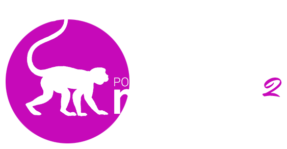
In case anyone want to use this, here it is. This one is meant for a dark background. Lets pimp Monkey 2.
Attachments:
November 11, 2016 at 10:07 am #4943Excellent idea
November 15, 2016 at 1:42 pm #5065how about a competition !
(svg looks better this got a bit munged – svg’s pose a security risk aparently!)
Attachments:
November 17, 2016 at 12:42 am #5125I like the idea and had a hack at adding Richard’s logo to the ‘new….simple mojo app’ template, but it looked pretty washed out on the medium grey default window background. Looks great on black, but I’d like to still with ‘grey’ for the default.
Ditto, the pink monkey above looks a bit rough on ‘charcoal blue’ or whatever color the forums now use!
I think for starters a logo will need at least a border + solid background color, so it can be safely used on *any* background. Perhaps a slightly toned down version of the ‘monkey circle’ above?
I’m still open to ideas regarding logos etc, but I do also like to give things a try for a while before discarding them.
November 17, 2016 at 1:09 am #5129Do you have a (much) larger version of the monkey circle, I could have a crack at it if you like?
Get your point about borders and backgrounds…
November 17, 2016 at 8:23 am #5135SVG format would be better
November 17, 2016 at 7:11 pm #5161Actually, looks like there’s a monkey2logo.svg in src/launcher!
November 17, 2016 at 9:49 pm #5177a little more like this? (text would need to be filled in if you want a smaller version)
Attachments:
September 17, 2017 at 8:10 am #10573Just found this old thread…
this is my suggestion
edit: And one logo for the ADmobile pluginAttachments:
September 17, 2017 at 9:41 am #10577OK.
Lets assume that the logo could be on any color background.
So… Lets keep the logo white – which can be coloured as needed by using Color.
This also means it can be used mono on headers, paper, etc in black
Lets also assume that there should be a good minimum size for more small windows that will also scale well and look good on larger windows.
lets assume that 640×480 would be a good minimum
So, the logo should be small than that but not too much and in white (only) for better detail.
Next up we want to use a font that is good. So how about a classic gill sans?

Here shown full size png that can be coloured on white so it looks black, etc
It solves the blur test (screw up your eyes and defocus). can you still make out the logo and main words?
It’s got the original logo with the swirled tail
It’s clean with no separation of monkey and 2
Feel free to criticise
September 17, 2017 at 11:43 am #10578Well, I choose some colors just to show a possible result: my idea was about the two-tail monkey and the gear (=building/production something?) – and of course they are just prototype to get ideas!
You could use gear+monkey silhouette in plain black on any background.And moreover I noticed that the plug-in logo are… nothing related to Monkey2 (and I think it should as they are they only paid-thing for Monkey2 at the moment).
September 17, 2017 at 1:49 pm #10579I like degacs’s idea with the two tail monkey and the two gears. I don’t know about that symbol on the second gear. I don’t know what it represent. Maybe it should have a phrase like “Multi-platform” or something that represent Multiplatform. I don’t know about it being just white either. It should have a fixed set of colors, Just like every other company logo. Just my 2 cents.
September 17, 2017 at 3:46 pm #10586The second gear is just an experiment about the module ADmobile (I just copied the logo from Itch.io)
Two gears close to represent the idea of plug-in, but repeat, just an idea.
Simply because the logo in itch.io has no reference at all to Monkey2, so potentially none could understand (except from the name) that it is for Monkey2 language.Of course we *should* mention the fact that there’s no direct link in the website to these modules: IAP and ADmobile…. maybe adding a STORE page with the link to Itch.io could be a simple solution (I think it tooks 10 minutes for Mark to add a new page and post on it the links).
Just my personal consideration, but I think – today – any language/dev tool is (in general) build/created to be multiplatform, from the desktop (win and MacOS) to the mobile (iOS, Android, HTML): so mentioning it in the logo seems (nowadays) useless.
Without considering the fall or the raise of new targets in the futures (just to mention Google Fuchsia for the newcoming era of IoT – I will keep an eye on it, BILLIONS of devices in the near future could run this OS and of course it need applications and tools, or something for AR/VR etc)September 19, 2017 at 7:32 am #10618And some with the pink circle added
diamond
more abstract
and further abstracted
 September 19, 2017 at 8:43 am #10619
Nice Adam, I was wondering how it looked with a handwritten font for the 2:
-
AuthorPosts
You must be logged in to reply to this topic.


