About Monkey 2 › Forums › General Programming Discussion › Powered by Monkey 2 logo.
Tagged: Logo Retro Oh Fucking Yes
This topic contains 53 replies, has 19 voices, and was last updated by ![]() Richard Betson
Richard Betson 8 months, 1 week ago.
-
AuthorPosts
-
September 19, 2017 at 12:29 pm #10623
That’s pretty darn good, peterigz, but does it scale down OK?
I thought degac’s twin-tails thing for Monkey2 was clever, and makes for a visual double-take, a little more attention-grabbing than just… a normal monkey.
September 19, 2017 at 2:39 pm #10624If you scale down you can just go with the monkey and circle on it’s own, depends on the space you have to fit it in. Can’t say I’m that keen on the 2 tails, just looks a bit odd to me, I can’t tell if it’s one monkey with 2 tails or one in front of another.
Scaled down minus the powered by, looks ok to me, Adam deserves the credit though I was just playing with it

 September 19, 2017 at 3:18 pm #10629
Something that’s always bugged me with the Monkey 2 logo is that the monkey is like the most basic monkey icon you can find heh.
If you Google ‘monkey icon’ similar ones show up multiple times. September 21, 2017 at 2:49 pm #10673
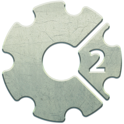
I had created this character a few months ago to be used in a game but I decided to change the theme instead.
Now for me is unusable but if is needed somewhere else let me know.Attachments:
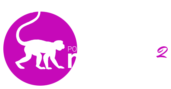
September 21, 2017 at 8:13 pm #10677I like Adam’s logo, but the shapes behind it are unnecessary, and in fact work against the nice alignments he created between the text and the monkey (i.e. he’s walking on the same “surface” as the words are settled on).
Here’s a two color version, just to see how it looks:

I also agree with Hezkore, a less “clip art” monkey would be welcome.
September 22, 2017 at 4:24 am #10687Managed to make a super quick cleanup monkey drawing… styling is still kinda “meh”, and I just went along with the same “monkey walking from the side” idea (again, super quick), but hopefully feels more clean and distinctive.
 September 22, 2017 at 5:06 am #10688
that’s a sad looking monkey
 September 23, 2017 at 1:47 am #10724
Yeah, the chin ended up looking like a nose (and the double chin like the normal chin!), so it looks like he has a big nose and is sadly looking down…
Will fix when I find some time.P.S. I hope you don’t mind us… monkeying…with your logo.
September 23, 2017 at 3:28 am #10737I like Adam’s logo with Peter’s “2”
October 1, 2017 at 9:57 am #10902Here’s a more final version (the pink 2 removed for clarity in viewing) with attention being put into viewing at smaller resolutions.
Attachments:
October 1, 2017 at 10:47 pm #10915Still prefer the pink 2 adds a bit of character… we need an “official” version and a vector version.
October 2, 2017 at 7:01 am #10923The font for the 2 was Mr Dafoe from google fonts btw incase you want to use it. For smaller icons I was thinking you could just write m2 as well.
October 13, 2017 at 7:42 pm #11093
Maybe it would be a good idea to start with the monkey logo and then work in a powered by.
No other language includes it’s version number except for maybe Perl 6 so I question the validity of including a 2.
Worst icon above (from a recent gltf support tweet) is in my view mozilla, hideous….
October 14, 2017 at 1:13 am #11094Most of those logos are for the company, not for a language.
You need examples of products, such as Oracle DB:

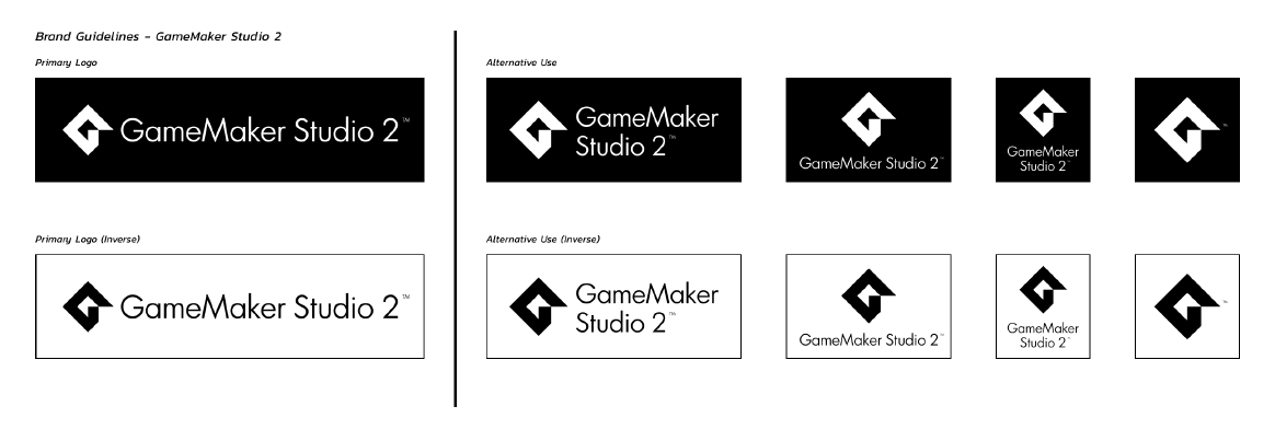
Or Game Maker 2:
Or HTML5:

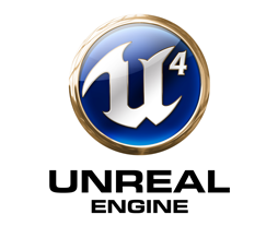
Or UE4:
Construct 2:
Until an official one has been decided on I’m using this one:
and
 October 14, 2017 at 5:27 am #11099
Here’ is the redesigned logo without the 2


-
AuthorPosts


You must be logged in to reply to this topic.