About Monkey 2 › Forums › General Programming Discussion › Powered by Monkey 2 logo.
Tagged: Logo Retro Oh Fucking Yes
This topic contains 53 replies, has 19 voices, and was last updated by ![]() Richard Betson
Richard Betson 8 months, 1 week ago.
-
AuthorPosts
-
October 14, 2017 at 5:30 am #11100
@therevils Please use the above 2 as your base!
DONT substitute the powered by with another typeface. This has been very carefully chosen for clarity.
I’m not getting into the ‘2’ issue, but agree about Simon remark about other not using numbers.
October 14, 2017 at 7:42 am #11104Still a (simple) Monkey.
Confusion with the previous one language MonkeyX is quite sure. Don’t know if it’s a good move or not.October 14, 2017 at 7:45 am #11105My person view is the 2 should be there and it should match and be clear
December 10, 2017 at 10:32 pm #12228I had the mood today to try something based on the previous character. You can actually see that I take a different approach to the logo. What are the reasons of doing so? You might ask… I don’t know if it’s good idea or not, only time will tell, once lots of other ideas are gathered, everything goes according to feedback.
My approach on this is design is that (1) how the logo looks and (2) how it looks when is shrinked down. (1) Every sort of project needs a logo that looks good, the problem (as I consider it) with the current monkey is that is more of an abstract representation which is more like a symbol of a monkey rather that the “Monkey Programming Language”. In this case is more of a branding issue. Also regarding for “how it looks when is shrinked” for example see the VSCode logo which looks awful because it has thin lines in it, the Sublime logo otherwise is superb.
And (2) that there should be a logo that is beefed up and looks good at low resolutions, such as websites, computer desktop icons, perhaps mobile devices. The problem with the current logo is that is very detailed and it has thin lines, when this logo is shrinked it becomes blurry and dirty. Especially on windows where the icons are small enough, on the other hand, mac users have better displays with retina resolutions etc…
Some other information regarding this one:
- lots of inspiration from cocos engine logo, so if you need to try your own remix you can look it up
- I made an attempt to move a bit away from the hard pink colors and bring a little red to them
- initially my character did not had hair on-top these come from the cocos logo, I would have to figure out whether to leave the hair or not, in this case I include both versions but open your paint application and do a paint-over to find out yourself
- the name of the font is called “ubuntu title” which is public domain, very important when choosing fonts to search for the licence, I am sure that better fonts can be found, I only spend 30 seconds to get this one because I was in a hurry
- I didn’t mention earlier that the monkey face is purposefully low poly, but this was a year ago when I did experiments in Blender 3D with low poly graphics. Other than that it fits naturally in Monkey 2 because is flatten and low poly logos always look better and they are some sort of a standard. Also when the graphics scale down (at icons) the operating system makes them smooth at preview. Is like getting two for the price of one.
- Finally, this upload is only a preview, is not final, it is only for trying to see what can be done.
Attachments:
December 11, 2017 at 12:23 am #12230Here’s my attempt at a logo. Figured making it from a pixel size would make it easier to see at a smaller level.


 December 11, 2017 at 12:26 pm #12235
I’m going with cocon’s logo. I like the colours and style.
December 11, 2017 at 12:28 pm #12236That’s cool, abe. That would be good as the site web icon.
December 11, 2017 at 5:58 pm #12237Thanks for the feedback! I’ve taken note of it and I’ve tried doing some more professional work.
All of them are rough drafts, none of them have been made into vector art yet, and the colors have been made as limited as possible. The focus right now is on the shapes and the general idea of the icon.
Extra notes:
– This is a combination of black, white, and alpha.
– Black colours will generall be replaced with a more appropriate color for the logo in the future
– White colours can also be replace, or left as white to allow users to blend a desired color
– Alpha is used for adding minimalistic detailHere they are! (And of course, imagine they have the “powered by monkey 2” somewhere)


Thanks for your time :). (1st and 3rd my favorites!)December 12, 2017 at 6:35 am #12243One last attempt at a more uniform logo – one which is one solid color, easily identifiable, scales nicely, and blends into monkey2’s name


One note: The font used is Fira Code.December 12, 2017 at 8:08 am #12245Those are very cool, abe. I like the style. The last one is very good.
December 12, 2017 at 7:40 pm #12250Thanks Amon, tried really hard :). I’ll keep making logos if one isn’t to be decided on
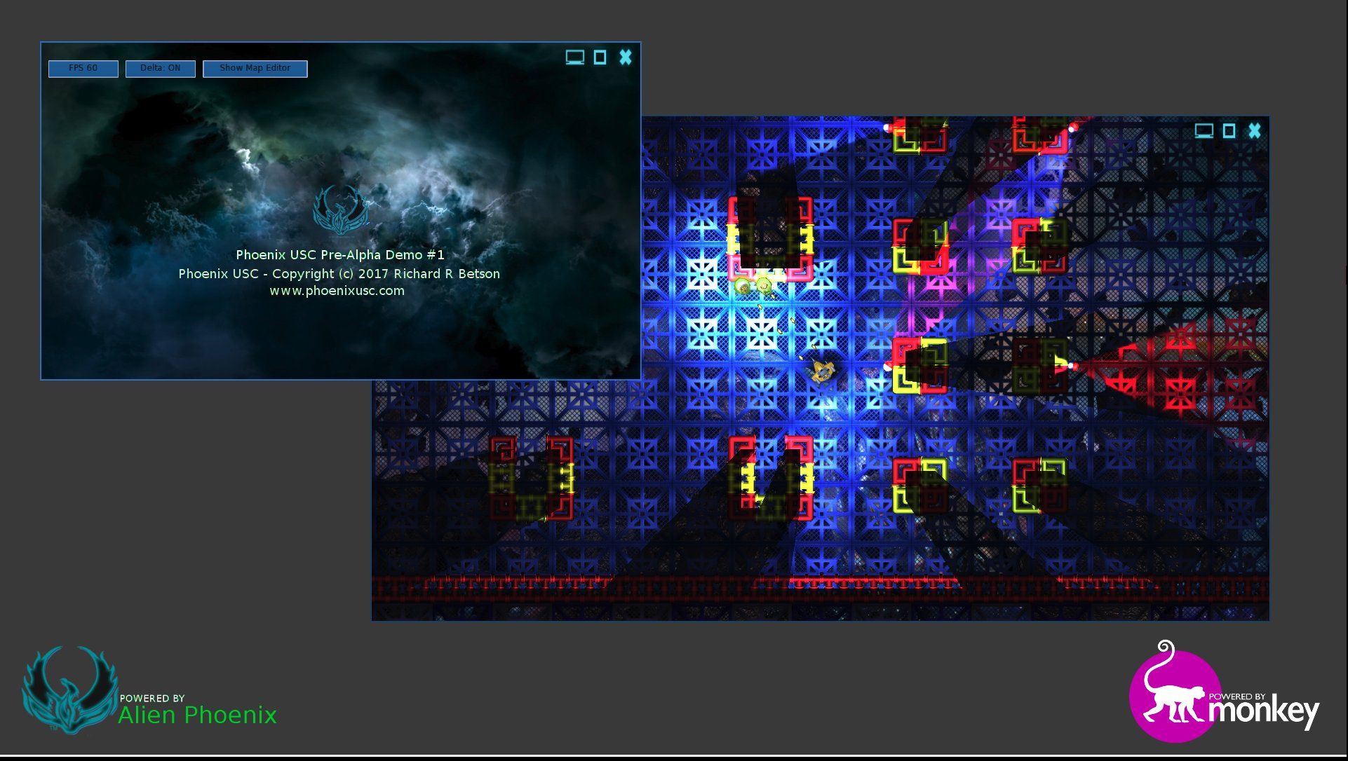
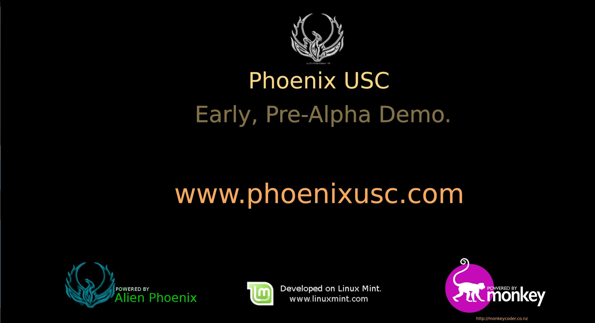
December 13, 2017 at 10:20 pm #12270I’d like to use the two images at the end of page two of this forum (monkey no number). Will appear in my next video.
Good work.
December 14, 2017 at 8:12 am #12280Thanks Richard
 December 14, 2017 at 12:25 pm #12285
Here is what it looks like on my video title screen. I think it looks great.
Attachments:
December 27, 2017 at 3:30 pm #12462 -
AuthorPosts
You must be logged in to reply to this topic.