About Monkey 2 › Forums › General Discussion › Website refresh
This topic contains 46 replies, has 17 voices, and was last updated by ![]() Diffrenzy
Diffrenzy 1 year, 2 months ago.
-
AuthorPosts
-
January 19, 2018 at 10:14 am #13027
I think you need to link your user up with a gravatar account if I remember…
OMG I spent 15 min trying to setup and link the gravatar but it’s not showing.. I quit for today. If anybody has clues to get it to work please tell. It’s a lot of work for an avatar picture! They say it makes life easier but I have some doubts.
There’s is a greyscaled logo and a colorful logo, they are both great but I rather like the colorful one.
 January 19, 2018 at 12:21 pm #13028
My other question is about the new logo – look fresher than the previous which is great. but if this is not reflected in the software then it starts to fragment things.
E.G.
how does this relate to the monkey2 software if the logos and visual style are completely different?Just a thought?

Oh, and while I’m at it. WTF is the CRAYON? if it is a code editor, then it should say code editor, also if code (crayon) is used, then there should be none of the CRAYON = chdsfi8734yt4thbh rubbish as well…
Also if you cut/copy from code, you get hidden line numbers!!!January 19, 2018 at 1:11 pm #13034There will be good to have “Read more” button in News section – to see short/clean blog entries and jump into if needed.
Good observation, changed the news listing to use excerpts and have a “Read More” button.
My other question is about the new logo
Give this a little time. In the long run I’m sure the same logo (when it’s settled on) will be the same on all channels.
“Crayon Syntax Highlighter” is a plugin. It does have a few issues that we are looking into, but all in all it’s not too shabby.
January 19, 2018 at 9:38 pm #13042Is that Monkey logo the new official Monkey2 logo?
Almost…I am 93% sure it will be, just need a few more days to decide for sure. I didn’t actually like it that much at first, but it has grown on me and I’m really more concerned if users are comfortable with it anyway, and everyone seems to be.
Also, Diffrenzy posted a logo image which I accidentally deleted using my clumsy god like admin powers (‘delete’ button is right next to ‘download’) so here’s hoping he will post it again.
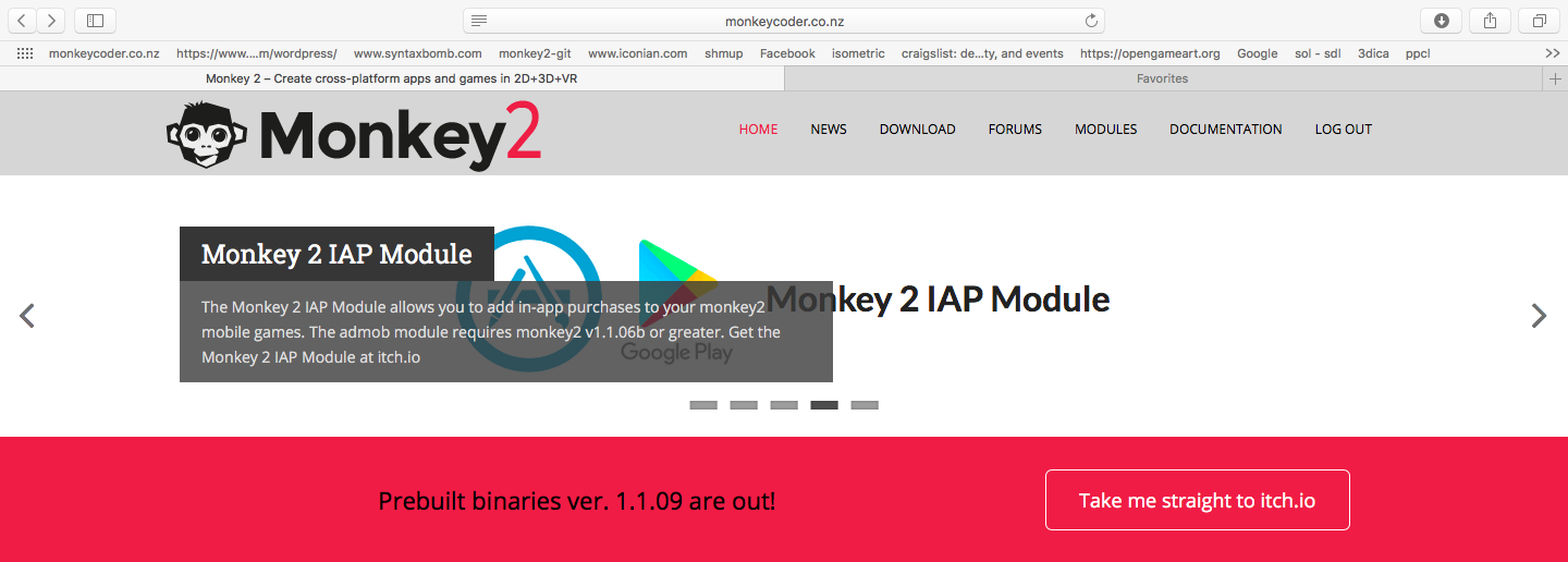
January 19, 2018 at 11:12 pm #13046I was just looking at the banners in the main page and looking at the add about the Monkey Iap Module I noticed that the text overlap the module Image/link. I don’t think that is intentional as it doesn’t look right. I don’t know how it looks on windows IE but in Mac’s safari this is how it looks:
Attachments:
January 20, 2018 at 12:15 am #13048Nice to have a new refresh of the site BUT
Please bring back a website theme changer.
This theme really hurts my eyes.
January 20, 2018 at 12:35 am #13049Almost…I am 93% sure it will be, just need a few more days to decide for sure
Well the deadline for my game is today, so 93% will have to do
Also could we get an alternative colour logo which will look good on a dark background?Edit: Just spotted the red monkey here:
http://monkeycoder.co.nz/wp-content/uploads/2018/01/slider_monkey.gif
Now just need the text in that colour too.January 20, 2018 at 2:34 pm #13091Logos and Icons are out!
http://monkeycoder.co.nz/monkey2-logo-and-resources/
@jesse : Cleaned up those “Featured Images” a bit.
January 20, 2018 at 11:07 pm #13125Thanks for the logos and icons!
I did a lo-fi version yesterday for my game and it’s not too different!
Attachments:
January 20, 2018 at 11:42 pm #13132I noticed the only way to get to the IAP thing seemed to be via the scrolling menu thing, maybe ought to have a more ‘solid’ page of its own, otherwise it’s quite hard to find, even if you saw it in passing! (Maybe under Modules -> Buy?)
January 21, 2018 at 11:34 am #13140@therevills : You are welcome
@druggedbunny : Good observation, I’ve made an “Official Addons” category, and put the paid modules in that.
Modules menu now has two entries “Official Addons” and “User Modules”.
January 21, 2018 at 3:12 pm #13148Could code be put into a [codebox]-like* box by default, ie. fixed-size with scroll bars? I find it takes way too much scrolling to get through a thread with full-length code by default.
Here’s an example of OMGSCROLLING!! (OK, I’m the guilty party here, but I’ve no choice!)
Alternatively, perhaps apply it to code over a certain short length (probably better), or at least make it an option?
* [codebox] being the BlitzMax forum tag as seen in the last two code-posts here.
January 21, 2018 at 3:14 pm #13149Also, still finding it all a bit blinding! Could the darker greys be made a little darker, and Edit/Reply be made clearer? (Ideally not so much pure white too!)
Nice work on the paid modules thing, that works well.
January 21, 2018 at 5:49 pm #13153Thanks for reporting back DruggedBunny.
I’ve limited the Crayon boxes to a max height of 500px for now, we can adjust that based on future feedback.
I’ll try and dim the colors, Try this link http://monkeycoder.co.nz/?customize_changeset_uuid=3776dc62-87bb-4d57-b66d-1c40f4811476 and tell me if that is enough.
Edit links made more clear. ( on Chrome you have to do a hard page refresh to see it )
[EDIT] : Changed forum topics to darker shades of grays.
January 21, 2018 at 7:55 pm #13155Yeah, definitely a lot better now, thanks for your efforts! Much better from my perspective anyway, looking good, and the code boxes too!
-
AuthorPosts
You must be logged in to reply to this topic.